

returning it to the caller). Because it is guaranteed to always return a good value, this code is much safer to use than the previous code.
Calculated physical relationships are a very powerful tool in Power BI and Excel modeling because they let you create very advanced relationships. In addition, the computation of the relationship happens during the refresh time when you update the data, not when you query the model. Thus, they result in very good query performance regardless of their complexity.
Using dynamic segmentation
There are many scenarios where you cannot set the logical relationship between tables in a static way. In these cases, you cannot use calculated static relationships. Instead, you need to define the relationship in the measure to handle the calculations in a more dynamic way. In these cases, because the relationship does not belong to the model, we speak of virtual relationships. These are in contrast to the physical relationships you have explored so far.
This next example of a virtual relationship solves a variation of the static segmentation we showed earlier in this chapter. In the static segmentation, you assigned each sale to a specific segment using a calculated column. In dynamic segmentation, the assignment happens dynamically.
Imagine you want to cluster your customers based on the sales amount. The sales amount depends on the slicers used in the report. Therefore, the segmentation cannot be static. If you filter a single year, then a customer might belong to a specific cluster. However, if you change the year, the same customer could belong to a different cluster. In this scenario, because you cannot rely on a physical relationship, you cannot modify the data model to make the DAX code easier to author. In such a case, your only option is to roll up your sleeves and use some advanced DAX to compute the value.
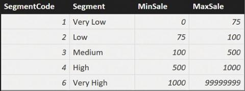
You start by defining the configuration table, Segments, which is shown in Figure 10-4.
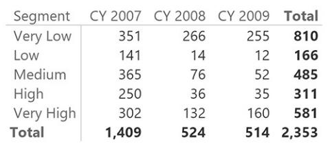
FIGURE 10-4 The configuration table for dynamic segmentation.
The measure to compute is the number of customers that belong to a specific cluster. In other words, you want to count how many customers belong to a segment, considering all the filters in the current filter context. The following formula looks very innocent, but it requires some attention because of its usage of context transition:
Click here to view code image
CustInSegment := COUNTROWS (
FILTER ( Customer, AND (
[Sales Amount] > MIN ( Segments[MinSale] [Sales Amount] <= MAX ( Segments[MaxSale
)
)
)
To understand the formula behavior, it is useful to look at a report that shows the segments on the rows and the calendar year on columns. The report is shown in Figure 10-5.
FIGURE 10-5 This PivotTable shows the dynamic segmentation pattern in action.
Look at the cell that shows 76 customers belonging to the Medium cluster in 2008. The formula iterated over Customer, and for each customer it checked whether the value of Sales Amount for that customer fell between MIN of MinSale and MAX of MaxSale. The value of Sales Amount represents the sales of the individual customer, due to context transition. The resulting measure is, as
expected, additive against segments and customers, and nonadditive against all other dimensions.
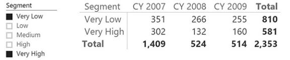
The formula only works if you select all of the segments. If you select, for example, only Very Low and Very High (removing the three intermediate segments from the selection), then MIN and MAX will not be the correct choice. They would enclose all the customers, which would give the wrong results in the grand total, as shown in Figure 10-6.
FIGURE 10-6 This PivotTable shows wrong values when used with a slicer with non-contiguous selections.
If you want to let the user select some of the segments, then you need to write the formula in the following way:
Click here to view code image
CustInSegment := SUMX (
Segments,
COUNTROWS ( FILTER (
Customer, AND (
[Sales Amount] > Segments[MinSale], [Sales Amount] <= Segments[MaxSale]
)
)
)
)
This version of the formula does not suffer from the issue of partial selection of segments, but it might result in worse performance because it requires a double iteration over the tables. The result is shown in Figure 10-7, which now yields the correct value.
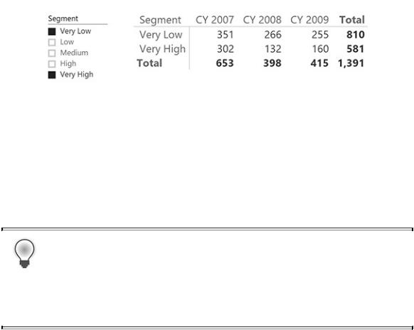
FIGURE 10-7 At the grand total, the two measures now show different values because of the partial selection of segments.
Virtual relationships are extremely powerful. They do not actually belong to the model, even if the user perceives them as real relationships, and they are entirely computed using DAX at query time. If the formula is very complex, or if the size of the model becomes too large, performance might be an issue. However, they work absolutely fine for medium-sized models.
Tip
We suggest you try to map these concepts in your specific business to see whether this pattern can be useful for any stratification you might want to pursue.
Understanding the power of calculated columns: ABC analysis
Calculated columns are stored inside the database. From a modeling point of view, this has a tremendous impact because it opens new ways of modeling data. In this section, you will look at some scenarios that you can solve very efficiently with calculated columns.
As an example of the use of calculated columns, we will show you how to solve the scenario of ABC analysis using Power BI. ABC analysis is based on the Pareto principle. In fact, it is sometimes known as ABC/Pareto Analysis. It is a very common technique to determine the core business of a company, typically in terms of best products or best customers. In this scenario, we focus on products.
The goal of ABC analysis is to identify which products have a significant impact on the overall business so that managers can focus their effort on them. To achieve this, each product is assigned a category (A, B, or C), so that the following is true:
 Products in class A account for 70 percent of the revenues.
 Products in class B account for 20 percent of the revenues.
 Products in class C account for 10 percent of the revenues.
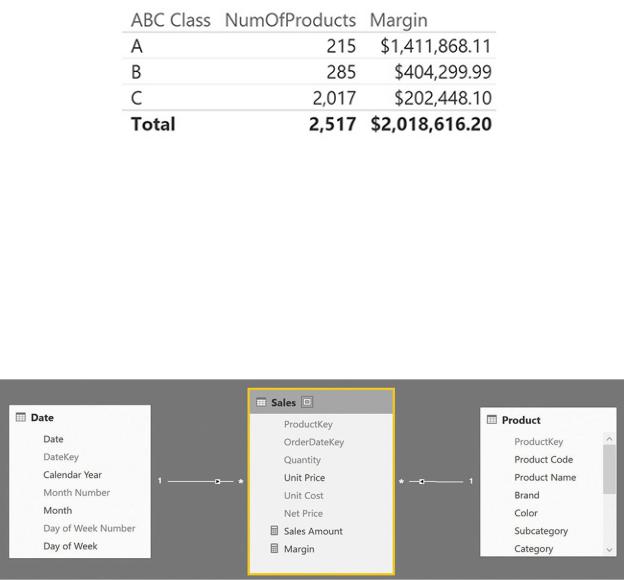
The ABC class of a product needs to be stored in a calculated column because you want to use it to perform analysis on products, slicing information by class. For example, Figure 10-8 shows you a simple PivotTable that uses the ABC class on the rows.
FIGURE 10-8 The ABC class is used in this report to show products and margins based on their class.
As often happens with ABC analysis, you can see that only a few products are in class A. This is the core business of Contoso. Products in class B are less important, but they are still vital for the company. Products in class C are good candidates for removal because there are many of them and their revenues are tiny when compared with the core products.
The data model in this scenario is very simple. You need only sales and products, as shown in Figure 10-9.
FIGURE 10-9 The data model to compute the ABC classes for products is very simple.
This time, we will change the model by simply adding some columns. No new table or relationship will be needed. To compute the ABC class of a product, you must compute the total margin of that product and compare it with the grand total. This gives you the percentage of the overall sales for which that single product

accounts. Then, you sort products based on that percentage and perform a rolling sum. As soon as the rolling sum reaches 70 percent, you have identified products in class A. Remaining products will be in class B until you reach 90 percent (70+20), and further products will be in class C. You will build the complete calculations using only calculated columns.
First, you need a calculated column in the Product table that contains the margin for each product. This can be easily accomplished using the following expression:
Click here to view code image
Product[TotalMargin] = SUMX (
RELATEDTABLE( Sales ),
Sales[Quantity] * ( Sales[Net Price] - Sales[Uni
)
Figure 10-10 shows the Product table with this new calculated column in which the data is sorted in descending order by TotalMargin.
FIGURE 10-10 TotalMargin is computed as a calculated column in the Product table.
The next step is to compute a running total of TotalMargin over the Product table ordered by TotalMargin. The running total of each product is the sum of all

the products that have a value for TotalMargin greater than or equal to the current value. You can obtain it with the following formula:
Click here to view code image
Product[MarginRT] = VAR
CurrentTotalMargin = 'Product'[TotalMargin] RETURN
SUMX ( FILTER (
'Product',
'Product'[TotalMargin] >= CurrentTotalMa
),
'Product'[TotalMargin]
)
Figure 10-11 shows the Product table with this new column.
FIGURE 10-11 MarginRT computes a running total over the rows that are sorted by TotalMargin.
The final point is to compute the running total sales as a percentage over the grand total of margin. A new calculated column easily solves the problem. You can add a RunningPct column with the following formula:
Click here to view code image
Product[MarginPct] = DIVIDE ( 'Product'[MarginRT],
SUM ( 'Product'[TotalMargin] ) )
Figure 10-12 shows the new calculated column, which has been formatted as a percentage to make the result more understandable.
FIGURE 10-12 MarginPct computes the percentage of the running total over the grand total.
The final touch is to transform the percentage into the class. If you use the values of 70, 20, and 10, the formula for the ABC class is straightforward, as you see in the following formula:
Click here to view code image
Product[ABC Class] = IF (
'Product'[MarginPct] <= 0.7, "A",
IF (
'Product'[MarginPct] <= 0.9, "B",
"C"
)
)
The result is shown in Figure 10-13.