


Designing a report with diagnostics results 363
•Operation: The operation that is performed.
•Start Time: Operation start time.
•End Time: Operation end time.
•Exclusive Duration (%): Time range of the event being active, expressed as a percentage.
•Exclusive Duration: The absolute time of the exclusive duration.
•Resource: Name of the resource you are accessing, in this case, the file path on your local PC.
•Is User Query: A true/false value that refers to whether the query was authored by the user (listed in the left-hand pane, APPLIED STEPS) or whether it was generated by some other user action.
•Group ID: Grouping created to approximate steps executed during the evaluation.
In the next recipe, we will see how we can design a report using this information.
Designing a report with diagnostics results
Once you have run the query diagnostics, it is important to know how to interpret these results. By just reading data from Power Query in a table, you can miss out on some relevant information. The best way to avoid this is to create a report on top of it by importing the diagnostics queries into a Power BI model and building visuals that can make sense out of that data.
Getting ready
For this recipe, you need to download the FactInternetSales CSV file. In this example, we will refer to the C:\Data folder.

364 Implementing Query Diagnostics
How to do it…
Once you open your Power BI Desktop application, you are ready to perform the following steps:
1.Click on Get data and select the Text/CSV connector.
2.Browse to your local folder where you downloaded the FactInternetSales CSV file and load it two times in order to make a comparison later in the recipe. You should have the following view:
Figure 10.12 – Queries pane
3.Rename the FactInternetSales query to FactInternetSales-example1 and FactInternetSales (2) to FactInternetSales-example2.
Figure 10.13 – Queries

Designing a report with diagnostics results 365
4.Select FactInternetSales-example1, click on OrderDateKey, and then click on the Remove Columns button.
Figure 10.14 – Column selection
5. Now select the ProductKey column and change the type to Text.
Figure 10.15 – Changing the data type
366Implementing Query Diagnostics
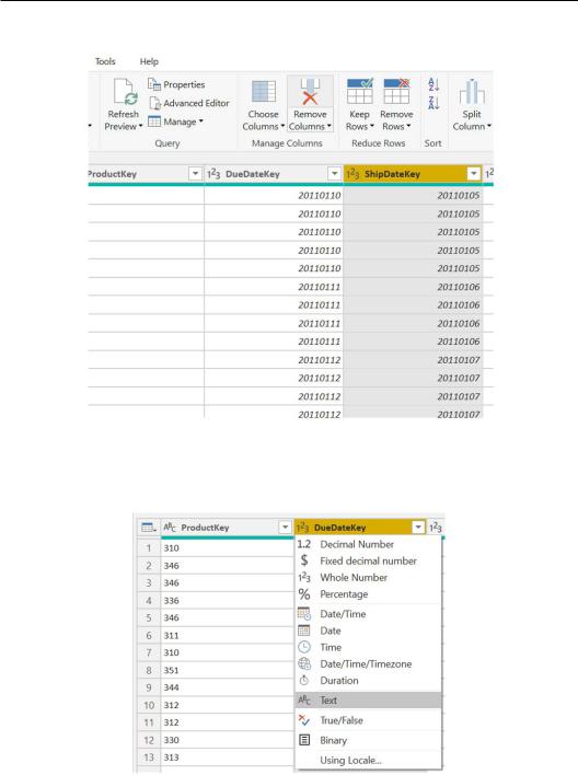
6.Select the ShipDateKey column and click on the Remove Columns button.
Figure 10.16 – Remove Columns
7.Now select DueDateKey and convert the data type to Text as you did in Step 5 for
ProductKey.
Figure 10.17 – Changing the data type
Designing a report with diagnostics results 367
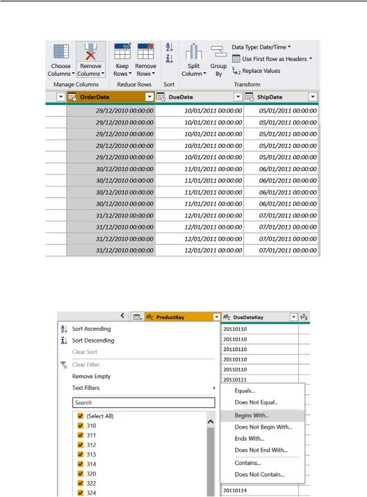
8.Now, browse to the end of the table, select the OrderDate column, and then click on the Remove Columns button to delete it.
Figure 10.18 – Removing a column
9.Apply a filter to the ProductKey column by clicking on the drop-down icon, then
Text Filters, and then Begins With….
Figure 10.19 – Filtering on the ProductKey column
368Implementing Query Diagnostics
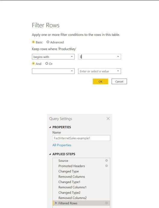
10.The Filter Rows window will pop up. Enter the value 3, as shown in the following screenshot, and click on OK:
Figure 10.20 – Filter Rows window
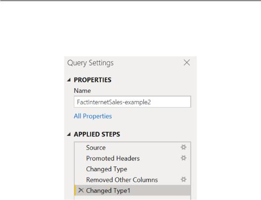
11.You should have a situation like in the following screenshot under the Query Settings pane:
Figure 10.21 – Applied steps

Designing a report with diagnostics results 369
We performed some steps, alternating between removing columns and data type changing steps.
This first part will help us make a comparison between two equal query outputs but with different step prioritizations that will be analyzed with Query Diagnostics.
Let's now work on the FactInternetSales-example2 query and replicate the next steps:
1.Select the FactInternetSales-example2 query and click on the Choose Columns button, as shown in the following screenshot:
Figure 10.22 – Column selection
370Implementing Query Diagnostics
2.Remove the flag from the OrderDateKey, ShipDateKey, and OrderDate columns (the last one is at the end of the list) and click on OK.
Figure 10.23 – Choose Columns
3.Select the ProductKey and DueDateKey columns, as shown in the following screenshot:
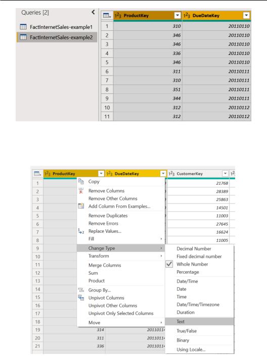
Designing a report with diagnostics results 371
Figure 10.24 – Multiple-column selection
4.Right-click on one of the two columns and click on Change Type and then Text to convert the data type for both columns.
Figure 10.25 – Changing the data type for multiple columns
372Implementing Query Diagnostics
5.Apply a filter to the ProductKey column by clicking on the drop-down icon and then on Text Filters and Begins With….
6.The Filter Rows window will pop up. Enter the value 3 and click on OK. You should see the following steps for the second example:
Figure 10.26 – Applied steps
As mentioned earlier, we now have two queries with the same output. Let's see how they perform and how much time it takes to apply the steps considering their different sequences.
Let's record a diagnostic session to see whether there are any differences between the two approaches by following the next steps:
1.Browse to the Tools tab and click on Start Diagnostics.
2.Then, browse to the Home tab and click on Refresh Preview and then Refresh All.
3.Go back to the Tools tab and click on Stop Diagnostics.
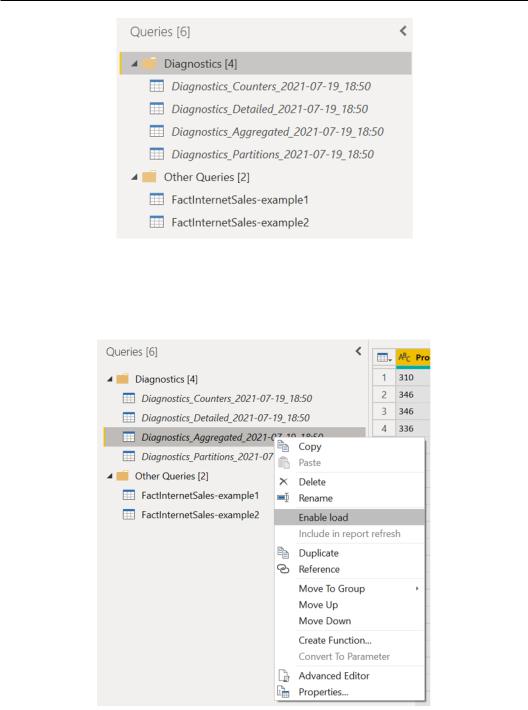
4.You should see, under the Queries pane on the left side of the UI, a folder named Diagnostics and four queries as diagnostics output.
Designing a report with diagnostics results 373
Figure 10.27 – Diagnostics output queries
5.Right-click on the query that starts with Diagnostics_Aggregated in order to analyze the key information that we need and click on Enable load to load the data in the final data model and build visualizations on top of it.
Figure 10.28 – Enable load for diagnostics queries
374Implementing Query Diagnostics
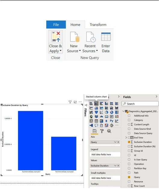
6.Click on the Close & Apply button to load the data and pass it to the visualization part.
Figure 10.29 – Close & Apply button
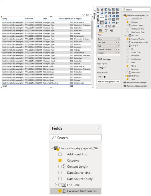
7.Under the Fields section in Power BI Desktop, you can see the diagnostics data. Select Exclusive Duration and Query under Fields, and then select Stacked column chart, as shown in the following example:
Figure 10.30 – Stacked column chart creation
Designing a report with diagnostics results 375
You can see the exclusive duration of FactInternetSales-example1 is almost double that of FactInternetSales-example2.
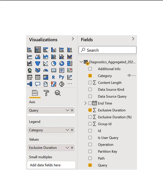
8.Select Category for Legend to see the column chart broken down according to the Category type that was performed.
Figure 10.31 – Bar chart enrichment

376 Implementing Query Diagnostics
You will see Exclusive Duration by Query and Category and you can spot what the operations taking more time to be applied are.
Figure 10.32 – Bar chart with legend
9.You can also create a table with the data you need. You can see the following example with a table with Query, Start Time, Step, Exclusive Duration, and Category:
Designing a report with diagnostics results 377
Figure 10.33 – Table visual for diagnostics data
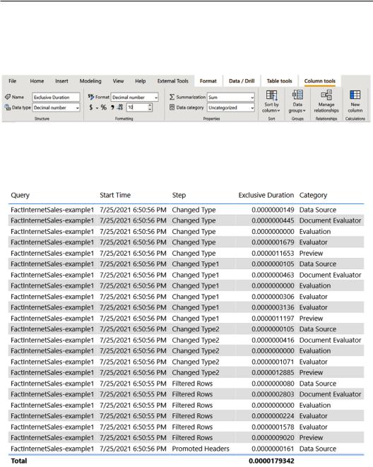
10.In this example, the steps were performed in few-second fractions; in order to read them, we can add more decimal places for the values. Under the Fields section, click on Exclusive Duration to see the background behind the value, as in the following example:
Figure 10.34 – Formatting a column by decimal type
378Implementing Query Diagnostics
11.After you have selected Exclusive Duration, the Column tools tab will pop up on the top section of the Power BI Desktop UI. Under that tab, in the Formatting section, enter the number of decimal places you want to see, in this case, 10, and press Enter on your keyboard.
Figure 10.35 – Column tools and Formatting
12.You will see how Exclusive Duration will now be easier to analyze on the table visual.
Figure 10.36 – Table visual